Posts Tagged ‘paint’

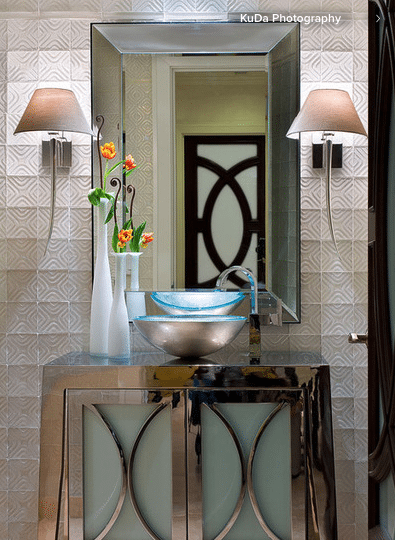
Pangaea’s Spin on Powder Rooms that REALLY Preform

Friday, December 2nd, 2011

The Holiday season is in full swing and with guests pouring through the door, your powder room will seriously be put to the test. Set your powder room up to pamper your guests and see how to spend your party time enjoying yourself instead of refreshing the supplies!

Get the Latest On Hot Design Trends, Trade Secrets, DIY Tips & Design Advice
Email:


For Email Marketing you can trust


Tags: , , , , , , , , , , , , , , ,
Posted in Bathroom, Colors, Cool Ideas, Cool Stuff, Design Tips, Furniture, Mistakes: Avoiding & Fixing, Storage Solutions, Top Ten, Uncategorized | No Comments »

Portland Interior Designer Shares 5 Things to Change to Sell Your Home

Monday, April 4th, 2011

Okay, I am not going to launch into the misery of the housing market right now. What I will say is that competition is fierce for the sales being made. If you want your house to sell, you absolutely must do all you can to prepare your home to show it at its very best.

So what changes should you make to your property before you sell?

And what should you leave alone?

1. Kitchens:
This is not the time to do a major kitchen remodel. You will not get your money out of it and it’s too late for you to enjoy the new kitchen. But you can make updates that count and will really appeal to buyers. Paint older wood cabinets that are too old to appeal to buyers looking for contemporary style and too new to appeal to buyers looking for historical properties. 1980′s oak is not vintage and it’s never coming back in style! White cabinets are more popular than ever, so painting your cabinets white is almost a no-brainer. If you have brass colored cabinet hardware or the hardware is cheap looking – replace it. Satin nickel or oil rubbed bronze continue to be the most popular and your choice depends on the rest of the kitchen finishes. Only replace the counter top or sink if they are in bad condition or not a neutral color. Remove wallpaper and paint a fresh, current color on the walls.

2. Bathrooms: Again, this is not the time to do a major remodel.. But you should update outdated bathrooms as much as possible. Attractive, up to date lighting fixtures and hardware are relatively easy upgrades that make a big difference. Again — get rid of brass and replace with satin nickel or oil rubbed bronze. It can also be worth it to replace the vanity and sink with a current style if yours is outdated or is in poor condition. Replacing a builder wall-to-wall plate glass mirror with a beautifully framed mirror is another simple and affordable upgrade that appeals to current buyers. Only re-tile the tub surround if the tile is in poor shape or not neutral in color. Remove wallpaper and paint a fresh color on the walls.

3. Flooring: If your carpeting is not a neutral color or it is worn out or stained you need to replace it – period. Do not even THINK about leaving it and offering a carpet allowance. The very sight of a worn, stained, or colored carpet is a deal breaker for buyers. The only buyer interested in a home with a worn, stained or colored carpet is a professional house flipper. They will scoff at your carpet allowance and offer you a low-ball price so low it will take you a week to get your jaw back up off of your worn, stained or colored carpet.

Kitchen Flooring especially takes a beating. It is often a different flooring than the rest of the house, so replacing it can be affordable and go a long way toward making the kitchen feel new and fresh.

4. Entry: Your front door needs to look wonderful! Remove screen or storm doors from your front door. If your door is a beautiful one that is just in need of paint or stain, then freshen it up that way. But if you have a front door that doesn’t even look pretty painted, it is worth it to install a new front door. Check out this blog I wrote to see before and after photos that show just how big of an improvement a beautiful front door can make.
New Front Door & Exterior Paint Color Selection: Just Two Changes Make a Huge Difference

5. Paint: Remove wallpaper, and paint any room that has beat up looking paint or that is a color which will not have wide appeal to buyers. It does not matter how tasteful – cheerful – cute – beautiful – vintage – _________ (insert your glowing adjective here) you think your wallpaper is. Having wallpaper — ANY wallpaper — will seriously reduce the percentage of buyers that will consider buying your house.

Is the exterior paint on your house in poor shape or a dated color scheme? Tan with forest green trim? Dark brown with tan trim? White with brown trim? Or perhaps a strong color? Bright yellow? Bright blue? Then you need to paint your exterior also. Exterior paint colors can be tricky to select. A a paint color consultation will help you get it right the first time. When I give exterior paint color consultations I take into consideration any stone or brick on the house, your roof color, and the neighbors’ house colors to be sure that yours will look attractive.

For a little help on interior paint colors to select when selling your home check out this blog I wrote.

Paint Color to Sell Your House: It Isn’t White!

Tags: , , , , , , , , ,
Posted in Bathroom, Colors, DIY, Design Dollars, Design Tips, Flooring, Home Staging, Kitchen, Lighting, Mistakes: Avoiding & Fixing, Uncategorized | No Comments »

Natural Inspiration for Interior Design Color Palettes

Tuesday, December 28th, 2010

You’re probably wondering why I have a picture of birds on an interior design blog. Trust me — there is a method to my madness. And before you go there — no smart remarks about my design advice being for the birds!

Last week a client was talking to me a few days before our paint color consultation at her new home. When I asked her if she already had furnishings that would affect our color choices, she shook her head and said “I know, I know. I’m doing this absolutely backwards. I know I’m supposed to pick the furniture first and paint is supposed to be the last thing — I get it. But it’s going to be a long time before I can buy new furniture and I can’t stand the thought of being surrounded by white walls.”

Have you been in that position? Choosing paint colors for a new home or remodel can be daunting if you don’t have anything yet to work from. But you can use anything that has a beautiful grouping of colors to be your guide — even if it won’t actually be something in your house later.

So, now about the birds. The above photograph by Andrew Zuckerman is of 2 Lear’s Macaws. I was completely smitten with their blend of blue, aqua, soft gray-violet and hints of coppery tones. Below are photos of things I found that could be put into a room that would carry off this color scheme. Remember, I saw the birds first, then chose things that went with their colors. The chairs pick up the soft blue-greens, the draperies bring in the gray, and the artwork and the vase both have multiple colors found in the Macaw’s plumage. The colors below the photos are some possible directions you could go with paint colors.

Art, blue-violet-aqua-copperBertoia chairs and Platner tableblue violet vase

Divine paint colordivine paint colordivine paint colordivine paint color

If you’re looking for color inspiration, it’s okay to think outside the box. Design magazines aren’t the only place to find great ideas! Check out Andrew Zuckerman’s book “Birds” for some wonderful photography and some color inspiration. If Macaws and Parrots are too colorful for you there are Hawks, Owls and Eagles for some beautiful ranges of neutral colors.

You may also like:

An Inspiration Piece for Client’s Interior Decor

Art: Interior Design Starts With an Inspiration Piece


Get the Latest On Hot Design Trends, Trade Secrets, DIY Tips & Design Advice
Email:


For Email Marketing you can trust


Tags: , , , , , , , , ,
Posted in Colors, Cool Ideas, Design Tips, Interior Design, Shopping, Uncategorized | 4 Comments »

5 Quick & Inexpensive Pick-Me-Ups For a Tired Kitchen

Wednesday, June 30th, 2010

Are you living with a kitchen that has seen better days? I certainly am! My house – purchased almost 5 years ago – was built in the 70′s and the kitchen had not had updates of any kind. Eventually I will remodel. But when I do, it will be the kind of remodel that includes knocking down walls, moving windows, adding an exterior door and will cost tens of thousands. Business is getting better all the time, so hopefully the day is not far off when I can have the sleek and modern kitchen of my dreams like this beauty by Bulthaup.

Maybe you are living with a kitchen that is outdated, or even a new construction home with a kitchen that is bland and boring. If you aren’t ready for a full blown remodel, it doesn’t mean you can’t inject a fresh feel into your kitchen and do it affordably. In the meantime, why not make some quick and relatively inexpensive improvements that will make your kitchen more enjoyable and livable for now?

Today I’m sharing 5 ways to freshen up your kitchen without a remodel. These quick and lower cost improvements are also great for people who want to make their home look it’s best before putting it on the market.

1. Lighting: Just a few improvements in your kitchen’s lighting can make a dramatic impact in how warm and beautiful it looks and make your kitchen more functional. Under-cabinet lights are available in both plug-in models you can install yourself or hard-wired versions that will require an electrician. Getting ones that have a low and high setting means you can set them to bright so you can see to cook, and then turn them down to a soft glow for ambience when you are entertaining. This is especially nice in open plan homes because it makes great accent lighting. Placing them toward the front of the cabinets gives the best light over your work area. In the kitchen below, the under-cabinet lights cast a beautiful glow on the tile backsplash and light the countertop beautifully making it easy to see what you’re doing.

via Gardenweb

Updating ceiling light fixtures is another quick way to improve lighting. Removing an old dropped-ceiling fluorescent fixture and replacing it with track or spot lights gives a more contemporary look and better light. If you have higher ceilings in the kitchen, consider a chandelier to replace a nondescript ceiling light or ceiling pendants above a breakfast bar or kitchen island.

2. Backsplash: Changing your backsplash is a quick way to add interest or color without all the work and expense of changing out your countertops. In the kitchen below, the single row of 6″ x 6″ glass tiles adds shine and complements the color of the painted cabinets. Although glass tile is not cheap, you don’t need much to do a simple backsplash like this.

via HGTV, designed by Beth Haley

This beautiful stainless steel backsplash below is done in peel & stick tiles that require no grouting. They are carried at Lowe’s and are manufactured from 60% recycled material. When adding a new backsplash, take care to choose a material that relates to something else in the kitchen. The glass tiles above relate in color to the cabinets. The steel tiles below relate in finish to the cabinet and appliance hardware.

via Lowe’s

3. Paint and Paintings: Giving the walls a fresh coat of paint in a new color will give you an instant transformation. But an even easier way to add color and interest to a kitchen is to add art. Just as in other rooms, be sure to use art that is large enough for the wall to really make an impact. In the 50′s kitchen below, the bright orange countertop didn’t go well with the gold linoleum. This home was going up for sale and the client didn’t have the budget to change flooring or countertop. So the large colorful art with oranges, golds, reds and greens pulls together the disparate colors in the room.

You can incorporate art even when there isn’t much wall space. Inexpensive printed giclee canvases are easy to wipe clean, so they can be placed anywhere. Here I used art above the backsplash and below the wall cabinets to add a bit of color to this bland kitchen. Colorful accessories continue the color scheme.

4. Flooring: Kitchen flooring takes quite a beating. If your kitchen flooring is looking shabby, and it is different from the rest of the flooring in your house as is often the case – then changing it can be a relatively inexpensive project with big results. If you have old wood floors that are beyond refinishing, consider painting them. Painted checker board patterns are popular, but the kitchen below is very contemporary. I know this is unusual, but the dramatic black floor and charcoal wall work well against the white cabinetry and yellow tile behind the stove with a bright yellow chair as accent. Light colors like soft aqua or muted yellow-green work well in a kitchen too. Again, just be sure to relate the color to other finishes in your kitchen.

via apartmenttherapy.com

Other great flooring options are cork, or Marmoleum. Cork and Marmoleum both come in tiles and can be handled by an experienced do-it-yourselfer. Linoleum comes in a great range of patterns including ones that look like stone. Installation of the large sheet material is better left to a pro.

via apartmenttherapy.com

5. Hardware: If you have that shiny brass hardware from the 80′s – RUN – DON’T WALK, to your nearest hardware store! Your cabinet drawer pulls and handles and kitchen plumbing fixtures are like jewelry for your kitchen. Updating them is like getting a new tie to wear with your favorite suit, or a new necklace to wear with that classic dress you love. And just like a new tie or a new necklace, new hardware will change the look of your kitchen equally as effectively. But before you are tempted to pick the cheapest ones you can find — let me say this: hardware is something that you touch everyday. It should feel good in your hand and be of a good quality.

Choose a style and finish that works with the rest of your home. With thousands of styles available, you can create any look you want — from simple traditional or contemporary styles — to highly decorative statements. Although it is possible to successfully mix metals in your kitchen, the finish should relate to other things in your home such as your light fixtures or other metals found in adjacent and visible rooms. In the first two photos below, these simple hardware styles complement the style of the cabinetry. The turquoise glass knob echos the color of the aqua glass inserts in the  cabinets, while the ornate tree shaped pulls work well with the elaborate leaf design carved into the wood.

With so many choices available, it can be overwhelming. But just choose one of the above five steps to get started. For most people, the kitchen is the heart of the home, so making it more appealing will give you a big payoff in enjoyment for yourself — or in speed of sale if your house is going on the market.

If you still aren’t sure which changes would be the best for your kitchen, I can help you decide your first step. Give me a call or email me today to set up an in-home visit or online consultation.

You may also like:

Painting Kitchen Cabinets: Which Color Would You Choose?

Home Staging Success: Portland Home Sold In One Day … See How


Get the Latest On Hot Design Trends, Trade Secrets, DIY Tips & Design Advice
Email:


For Email Marketing you can trust


Tags: , , , , , , , , , , , , ,
Posted in Art, Colors, Cool Ideas, DIY, Design Dollars, Design Tips, Flooring, Home Staging, Interior Design, Kitchen, Lighting, Uncategorized | No Comments »

Painting Kitchen Cabinets: What Color Would You Choose?

Monday, May 24th, 2010

Lately I’ve been a little obsessed with painting kitchen cabinets. Again, it’s my clients’ needs and issues that drive my focus. I’ve had several home staging consultations recently with clients who have very outdated oak cabinetry from the 80′s. I’ve also had some interior design clients who would like to update their kitchens – but who intend to sell within the next 2 or 3 years and so they don’t want to put the money into a big remodel, or even into refacing the cabinets. So, painting the cabinetry is a great way to go. That is until the husband hears about the plan. What is it with men and wood anyway?? I’ve got to share this excerpt from a post on White Kitchen Cabinets written by Vancouver, B. C. Interior Designer and Colour Expert (she’s Canadian so we’re spelling color with a “u” in her honor), Maria Killam. Posted here with her permission.

“80′s Oak Kitchen Cabinets

80's kitchen

“Here is a photo of a typical oak kitchen mostly installed in this era of kitchens. When I am standing in a kitchen that looks very much like this one, and I recommend that this kitchen be painted white or cream–as soon as the words out of my mouth–the wife’s face lights up and the husband looks horrified at the prospect of painting THE WOOD! I’m not sure why most men have this reaction but it’s pretty common. Men usually come around once they understand that it’s not about the wood, it’s about the fact that it’s dated. And to be clear, I don’t advocate painting ALL WOOD, just kitchens in this era. So for those of you with this kitchen, reading this right now, there’s really just one thing you need to know: This kitchen IS NEVER COMING BACK. So the only way to extend the life of it is to prime it, paint it, and install new brushed nickel hardware. Period, end of conversation.” –
Maria Killam

This is so TRUE! On my last consultation, the wife finally begged me to call her husband directly to convince him that the cabinets needed to be painted. He finally came around when he realized that 80′s oak cabinets look as outdated to other people as old wood paneling from the 50′s looks to him. Great analogy to try if you need to convince a man to paint over wood.

So once you commit to painting those cabinets, would you go with white or a color?

For immediate resale, I generally recommend white or cream depending on the counter tops, tile and flooring. It gives a blank slate to the incoming buyer. Although I do like the clean and fresh look of white cabinetry (and I have pronounced minimalist tendencies) – having a kitchen in total – complete – unrelieved white is too sterile and cold for me. I generally like the walls to be painted in a color to give warmth or at least for there to be some natural wood in flooring or countertops. In the white kitchen below, they painted the interiors of the glass fronted cabinets in a nice spring green to add some color. I like it, and I think it would have been even prettier if the floors were a light natural wood. What do you think?

White painted kitchen cabinets with green accented interiorssource

But the more I look through photos of painted kitchen cabinets, the more I am drawn to pale colors. I love the soft sage green cabinetry with the rough natural wood in the kitchen below. Very comfortable & casual in feel.

pale green kitchen cabinets with natural wood beamssource

In the next photo, the soft blue-green on the modern slab front cabinets brings out the green tones in the slate flooring. I absolutely cannot get over the cute cow legged table & chairs! This must be where the kids eat. FUN! Okay, so I’m getting a little distracted from my topic. I just think the soft color is so much warmer than white cabinets would have been.

pale aqua modern kitchen cabinetssource

I positively love this next kitchen with the white cabinets up top and the dramatic charcoal color of the base cabinets. Again, the use of natural wood accents and flooring gives it warmth. Wonderful blend of traditional and contemporary!

kitchen with white wall cabinets and charcoal base cabinetssource

Here is one that I think is especially fun. The red chairs and accessories look great in this yellow-green kitchen. The letters on the frosted glass front cabinets are a great detail. It’s very contemporary, but in a nice warm way. This just feels like it would be a great kitchen to spend time in. The colors feel happy.

green kitchen cabinets

via Coastal Living

So, what do you think? If you were going to paint your cabinets, what color would you choose?

Related posts:

Paint Color to Sell Your Home: It Isn’t White!

Portland Home Staging Success: Sold In One Day – In This Market! See How …

Get the Latest On Hot Design Trends, Trade Secrets, DIY Tips & Design Advice
Email:


For Email Marketing you can trust


Tags: , , , , , , , , ,
Posted in Colors, Design Tips, Kitchen, Uncategorized | 3 Comments »

Paint Color to Sell Your Home – It isn’t White!! – Portland Home Stager Shares Paint Color Tips

Saturday, August 29th, 2009

For decades, when you got ready to sell your house, the conventional wisdom was to paint all the walls back to white. But that is SO yesterday!  White …. the color of snow & ice … does absolutely nothing to warm up a house. It doesn’t highlight architectural features and it doesn’t enhance the colors of your wood, granite or other finishes. To sell your property today, it’s best to use soft warm decorator colors that are current. That way they not only look beautiful in the home, but will go with the existing furnishings of your prospective buyers and remind them of the beautiful new furnishings and colors they have been eyeing at the stores in anticipation of their new home.

olive Devine Color mochaDevine Paint color ReflectionDevine Paint color Teak

A professional paint color consultation will help you paint out the colors that turn buyers off and select ones that appeal to them.

Accent Walls: Do you know which walls should be accented? Where should the accent color start and stop? An accent wall can create or enhance a focal point or it can highlight architectural interest. It might be the wall with the fireplace, built in shelving, or the wall that soars up two stories. Selecting the wrong wall for your accent can pull focus away from important features of your house or even make a room feel unbalanced, which most people sense as a vague feeling of discomfort in the room, even if they can’t put their finger on why it feels that way.

Red Walls: I’m afraid that the news here is you need to paint those out! Although many people like to paint dining rooms red, and I see them all the time, red walls stop most buyers in their tracks. Any broker will tell you … well, they’ll tell you if they aren’t afraid of losing your listing by offending you … that they get negative feedback when showing properties that have bold red walls of any shade. Red is a tough sell. Why leave something in your home that has the potential to turn off so many people? When I stage a home, I can mitigate some of that impact through the use of art and accessories … but doing both the painting and the staging will give you the most attractive results.

The same goes for any bright, bold or “too deep” colors. If the color names “sunny yellow” “hunter green” “peach” “federal blue” “maroon” or “burgundy” can be used to describe any of your rooms, then a paint color consultation is in your future.

Even though guests in your home over the years “always say they love my: bright yellow kitchen, red dining room, hunter green family room, _________” (fill in the blank with your personal boldly colored room) don’t fool yourself into thinking that means the colors can stay. The problem here is that when guests come over they aren’t thinking of living in your house! I, too, would have to paint out my own beloved accent walls if I put my house on the market. So, don’t take it personally, it has nothing to do with having good or bad taste. It’s all about wide appeal.

The “Right” Colors: If I could tell you here the exact colors to use, I would do it … but it isn’t that simple. When I choose paint colors for a property going on the market, I look at the wood tones in floors, cabinetry, doors & moldings, and also consider any finishes such as granite colors, fireplace stones, carpeting, tiles, amount of light and exterior house colors as well. The colors of the house should flow from the outside to the inside and the colors in all rooms should work well enough together (not change radically) so that as you walk through the property, you always feel you are in the same house.

Colors that are soft and a little “smoky” or “creamy” work better than very pure colors. Think of colors like toast – caramel – taupe – sage & muted water colors.

Finishes: The right finish – satin – eggshell – flat – will make a difference too. In general flat, or matte finishes are very forgiving if your walls are not in perfect condition. They also look the most “true” to color because they don’t reflect a lot of light. Satin or eggshell finish paints have a little more of a sheen to them. They show imperfections in the walls so you need to prep your walls more carefully. They are very good for kitchen & baths where the walls may need to be cleaned more often. Use semi-gloss for moldings. High Gloss paint is generally best for painting cabinetry.

Sustainable: Remember to select paints that are “Green” — no I don’t mean the color! There’s just no good reason not to use paints with zero or low VOC’s. They are readily available and only run about $5 more per gallon than the ones with the nasty chemicals. Your prospective buyers will be happy that they don’t smell your new paint, and most of them will consider it a positive point about your property. Devine Color and Yolo Colorhouse are two locally produced, eco-friendly paint lines and I recommend them both! The paint color samples at the top of this post are from Devine Color. Both brands are sold at Powell Paint Center in Portland.

If you are in the Portland area and are getting ready to sell, call for your professional paint color consultation! Or, if you just want to freshen up your home, then a paint color consultation can help you select the right colors for your personal taste and style. Call today at 503.816.4394

Free Design Tips Sign Up
Email:


For Email Marketing you can trust


Tags: , , , , , ,
Posted in Colors, Design Tips, Home Staging, Sustainable style, Uncategorized | No Comments »