Posts Tagged ‘color’
The 3 C’s of Feminine Chair Flair – Pangaea Interior Design
Tuesday, December 20th, 2011
Men and women often have a difference in taste when it comes to furniture. If you are looking to add feminine style to your room, just use my “3 Cs” — curves, color and cloth — to turn up the feminine flair. Take a look at this for chairs that are all-girl!
| Get the Latest On Hot Design Trends, Trade Secrets, DIY Tips & Design Advice |
Tags: Bedroom, chair, cloth, color, Colors, Design Tips, dining chair, Interior Design, Living Room, Lofts, portland interior design, Seating, upholstery
Posted in Bedroom, Colors, Cool Ideas, Cool Stuff, Design Tips, Dining Room, Furniture, Interior Design, Kitchen, Living Room, Lofts, Shopping, Uncategorized, Upholstery | No Comments »
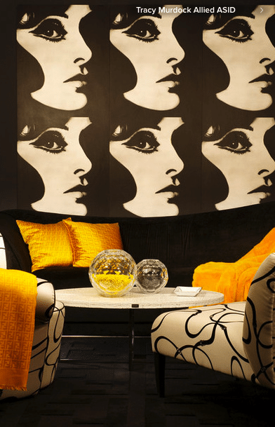
10 Ways to Make Your Neutral Palette Shine
Sunday, December 4th, 2011
Coming up with a successful color palette for your home interior can be stressful. Because of this, many people default to a neutral color palette only to end up with a lifeless and dull sea of beige! A mix of texture, pattern, quality materials and varying shades all play an important role in designing a neutral colored interior that is soothing and sophisticated.
| Get the Latest On Hot Design Trends, Trade Secrets, DIY Tips & Design Advice |
Tags: Bathroom, Bedroom, color, color palette, Colors, Design Tips, design trends, Flooring, home interior, Interior Design, interior design portland, Lighting, Living Room, neutral color palette, pattern, texture, upholstery, Window Treatments
Posted in Bathroom, Bedroom, Colors, DIY, Design Tips, Dining Room, Flooring, Furniture, Home Office, Interior Design, Lighting, Living Room, Mistakes: Avoiding & Fixing, Uncategorized, Upholstery, Wall Treatments, Window Treatments | No Comments »
Pangaea Interior Design’s 20 Alternatives to Fine Art
Tuesday, November 15th, 2011
So you’re telling me that you can’t spend half a year’s salary on original art work for the hallway? That’s okay. There are many alternatives for great wall decor without breaking the bank. Get creative with fabrics, found objects, natural elements, texture and even fish — oh yes, I did say fish! — to add your own personality and charm and fill your home with your unique style.
| Get the Latest On Hot Design Trends, Trade Secrets, DIY Tips & Design Advice |
Tags: Art, Bathroom, Bedroom, color, Design Tips, design trends, Dining Room, fabrics, Fireplace, found objects, hallway, Interior Design, Kitchen, Living Room, loft, Lofts, modern design, natural elements, texture, wall decor
Posted in Achievements, Art, Bathroom, Bedroom, Cool Ideas, Cool Stuff, DIY, Design Tips, Dining Room, Fireplace, Home Office, Interior Design, Kitchen, Lofts, Mistakes: Avoiding & Fixing, Pearl District, Shopping, Space Planning, Storage Solutions, Top Ten, Uncategorized, Upholstery, Wall Treatments | No Comments »
10 Design Strategies for Art Lovers
Thursday, June 9th, 2011
If you are an art lover, you know that buying and living with art is so rewarding! But did you know that what you do with your interior decor can actually boost the impact of your art?
Tags: Art, color, color palette, Design Tips, furniture arrangement, Interior Design, interior design portland
Posted in Art, Colors, Design Tips, Furniture, Interior Design, Lighting, Sculpture, Uncategorized | No Comments »
Portland Interior Designer Shares 5 Things to Change to Sell Your Home
Monday, April 4th, 2011
Okay, I am not going to launch into the misery of the housing market right now. What I will say is that competition is fierce for the sales being made. If you want your house to sell, you absolutely must do all you can to prepare your home to show it at its very best.
So what changes should you make to your property before you sell?
And what should you leave alone?
1. Kitchens: This is not the time to do a major kitchen remodel. You will not get your money out of it and it’s too late for you to enjoy the new kitchen. But you can make updates that count and will really appeal to buyers. Paint older wood cabinets that are too old to appeal to buyers looking for contemporary style and too new to appeal to buyers looking for historical properties. 1980′s oak is not vintage and it’s never coming back in style! White cabinets are more popular than ever, so painting your cabinets white is almost a no-brainer. If you have brass colored cabinet hardware or the hardware is cheap looking – replace it. Satin nickel or oil rubbed bronze continue to be the most popular and your choice depends on the rest of the kitchen finishes. Only replace the counter top or sink if they are in bad condition or not a neutral color. Remove wallpaper and paint a fresh, current color on the walls.
2. Bathrooms: Again, this is not the time to do a major remodel.. But you should update outdated bathrooms as much as possible. Attractive, up to date lighting fixtures and hardware are relatively easy upgrades that make a big difference. Again — get rid of brass and replace with satin nickel or oil rubbed bronze. It can also be worth it to replace the vanity and sink with a current style if yours is outdated or is in poor condition. Replacing a builder wall-to-wall plate glass mirror with a beautifully framed mirror is another simple and affordable upgrade that appeals to current buyers. Only re-tile the tub surround if the tile is in poor shape or not neutral in color. Remove wallpaper and paint a fresh color on the walls.
3. Flooring: If your carpeting is not a neutral color or it is worn out or stained you need to replace it – period. Do not even THINK about leaving it and offering a carpet allowance. The very sight of a worn, stained, or colored carpet is a deal breaker for buyers. The only buyer interested in a home with a worn, stained or colored carpet is a professional house flipper. They will scoff at your carpet allowance and offer you a low-ball price so low it will take you a week to get your jaw back up off of your worn, stained or colored carpet.
Kitchen Flooring especially takes a beating. It is often a different flooring than the rest of the house, so replacing it can be affordable and go a long way toward making the kitchen feel new and fresh.
4. Entry: Your front door needs to look wonderful! Remove screen or storm doors from your front door. If your door is a beautiful one that is just in need of paint or stain, then freshen it up that way. But if you have a front door that doesn’t even look pretty painted, it is worth it to install a new front door. Check out this blog I wrote to see before and after photos that show just how big of an improvement a beautiful front door can make.
New Front Door & Exterior Paint Color Selection: Just Two Changes Make a Huge Difference
5. Paint: Remove wallpaper, and paint any room that has beat up looking paint or that is a color which will not have wide appeal to buyers. It does not matter how tasteful – cheerful – cute – beautiful – vintage – _________ (insert your glowing adjective here) you think your wallpaper is. Having wallpaper — ANY wallpaper — will seriously reduce the percentage of buyers that will consider buying your house.
Is the exterior paint on your house in poor shape or a dated color scheme? Tan with forest green trim? Dark brown with tan trim? White with brown trim? Or perhaps a strong color? Bright yellow? Bright blue? Then you need to paint your exterior also. Exterior paint colors can be tricky to select. A a paint color consultation will help you get it right the first time. When I give exterior paint color consultations I take into consideration any stone or brick on the house, your roof color, and the neighbors’ house colors to be sure that yours will look attractive.
For a little help on interior paint colors to select when selling your home check out this blog I wrote.
Paint Color to Sell Your House: It Isn’t White!
Tags: Bathroom, color, Design Tips, Flooring, Home Staging, home staging portland, Kitchen, Lighting, paint, portland home staging
Posted in Bathroom, Colors, DIY, Design Dollars, Design Tips, Flooring, Home Staging, Kitchen, Lighting, Mistakes: Avoiding & Fixing, Uncategorized | No Comments »
Interior Design Trends at Las Vegas Design Market Winter 2011
Thursday, February 10th, 2011
Thought I would share this video highlighting the interior design trends at the Las Vegas Design Market. I particularly noticed so many natural materials such as live edge wood pieces and bleached wood in furniture. Enjoy the video!
Tags: color, color palette, design trends, honeysuckle, Interior Design, Las Vegas Design Market, Lighting, Living Room, modern design, pantone, portland interior design
Posted in Colors, Cool Stuff, Furniture, Interior Design, Lighting, Living Room, Shopping, Trends, Uncategorized | No Comments »
Natural Inspiration for Interior Design Color Palettes
Tuesday, December 28th, 2010
You’re probably wondering why I have a picture of birds on an interior design blog. Trust me — there is a method to my madness. And before you go there — no smart remarks about my design advice being for the birds!

Last week a client was talking to me a few days before our paint color consultation at her new home. When I asked her if she already had furnishings that would affect our color choices, she shook her head and said “I know, I know. I’m doing this absolutely backwards. I know I’m supposed to pick the furniture first and paint is supposed to be the last thing — I get it. But it’s going to be a long time before I can buy new furniture and I can’t stand the thought of being surrounded by white walls.”
Have you been in that position? Choosing paint colors for a new home or remodel can be daunting if you don’t have anything yet to work from. But you can use anything that has a beautiful grouping of colors to be your guide — even if it won’t actually be something in your house later.
So, now about the birds. The above photograph by Andrew Zuckerman is of 2 Lear’s Macaws. I was completely smitten with their blend of blue, aqua, soft gray-violet and hints of coppery tones. Below are photos of things I found that could be put into a room that would carry off this color scheme. Remember, I saw the birds first, then chose things that went with their colors. The chairs pick up the soft blue-greens, the draperies bring in the gray, and the artwork and the vase both have multiple colors found in the Macaw’s plumage. The colors below the photos are some possible directions you could go with paint colors.


If you’re looking for color inspiration, it’s okay to think outside the box. Design magazines aren’t the only place to find great ideas! Check out Andrew Zuckerman’s book “Birds” for some wonderful photography and some color inspiration. If Macaws and Parrots are too colorful for you there are Hawks, Owls and Eagles for some beautiful ranges of neutral colors.
You may also like:
An Inspiration Piece for Client’s Interior Decor
Art: Interior Design Starts With an Inspiration Piece
| Get the Latest On Hot Design Trends, Trade Secrets, DIY Tips & Design Advice |
Tags: color, color palette, Design Tips, Interior Design, interior design portland, paint, paint color, paint consultation, portland interior design, portland interior designer
Posted in Colors, Cool Ideas, Design Tips, Interior Design, Shopping, Uncategorized | 4 Comments »
Portland Interior Designer Shares: Leftover Paint Recycling News!
Friday, July 2nd, 2010
Today in the news there’s something GOOD for a change! Oregon has a new law and program to help recycle leftover paint. Read the full article on the new Paint Stewardship Law here.
I know that after painting rooms I always end up with paint left over. And I love to change paint colors in my house every so often because it’s such an easy way to change the look. So all that paint adds up. Here’s a great tip on the best way to properly store paint for later use (from the article).
Place plastic wrap on the tops of paint cans before fitting lids on snugly, and store upside down at a moderate temperature.
It’s great to have touch-up paint for the occasional dings we get in our walls. But once you change colors in your house and no longer need the old color on hand, it’s great that you now have a much easier way to get your paint into a recycling center.
This is also good news if you’ve ever bought a gallon of paint and begun painting – only to realize you really blew it on the color! Now you have a whole gallon of paint you won’t be using! Of course, this wouldn’t be happening to you if you had hired me to give you the best paint color consultation you’ll ever have!
And when you are choosing your paint in the first place – be sure to ask for zero VOC paint. I’m using a Benjamin Moore low VOC paint for my kitchen cabinets in my current project. Almost all of the paint brands now have a zero VOC option. Just ask!
You may also like:
Painting Kitchen Cabinets: What Color Would You Choose?
Paint Color To Sell Your Home: It Isn’t White!
Tags: Benjamin Moore, color, color consultation, paint color, recycling, sustainable style
Posted in Colors, DIY, Interior Design, Mistakes: Avoiding & Fixing, Sustainable style, Trends | No Comments »
Painting Kitchen Cabinets: What Color Would You Choose?
Monday, May 24th, 2010
Lately I’ve been a little obsessed with painting kitchen cabinets. Again, it’s my clients’ needs and issues that drive my focus. I’ve had several home staging consultations recently with clients who have very outdated oak cabinetry from the 80′s. I’ve also had some interior design clients who would like to update their kitchens – but who intend to sell within the next 2 or 3 years and so they don’t want to put the money into a big remodel, or even into refacing the cabinets. So, painting the cabinetry is a great way to go. That is until the husband hears about the plan. What is it with men and wood anyway?? I’ve got to share this excerpt from a post on White Kitchen Cabinets written by Vancouver, B. C. Interior Designer and Colour Expert (she’s Canadian so we’re spelling color with a “u” in her honor), Maria Killam. Posted here with her permission.
“80′s Oak Kitchen Cabinets“

“Here is a photo of a typical oak kitchen mostly installed in this era of kitchens. When I am standing in a kitchen that looks very much like this one, and I recommend that this kitchen be painted white or cream–as soon as the words out of my mouth–the wife’s face lights up and the husband looks horrified at the prospect of painting THE WOOD! I’m not sure why most men have this reaction but it’s pretty common. Men usually come around once they understand that it’s not about the wood, it’s about the fact that it’s dated. And to be clear, I don’t advocate painting ALL WOOD, just kitchens in this era. So for those of you with this kitchen, reading this right now, there’s really just one thing you need to know: This kitchen IS NEVER COMING BACK. So the only way to extend the life of it is to prime it, paint it, and install new brushed nickel hardware. Period, end of conversation.” – Maria Killam
This is so TRUE! On my last consultation, the wife finally begged me to call her husband directly to convince him that the cabinets needed to be painted. He finally came around when he realized that 80′s oak cabinets look as outdated to other people as old wood paneling from the 50′s looks to him. Great analogy to try if you need to convince a man to paint over wood.
So once you commit to painting those cabinets, would you go with white or a color?
For immediate resale, I generally recommend white or cream depending on the counter tops, tile and flooring. It gives a blank slate to the incoming buyer. Although I do like the clean and fresh look of white cabinetry (and I have pronounced minimalist tendencies) – having a kitchen in total – complete – unrelieved white is too sterile and cold for me. I generally like the walls to be painted in a color to give warmth or at least for there to be some natural wood in flooring or countertops. In the white kitchen below, they painted the interiors of the glass fronted cabinets in a nice spring green to add some color. I like it, and I think it would have been even prettier if the floors were a light natural wood. What do you think?
But the more I look through photos of painted kitchen cabinets, the more I am drawn to pale colors. I love the soft sage green cabinetry with the rough natural wood in the kitchen below. Very comfortable & casual in feel.
In the next photo, the soft blue-green on the modern slab front cabinets brings out the green tones in the slate flooring. I absolutely cannot get over the cute cow legged table & chairs! This must be where the kids eat. FUN! Okay, so I’m getting a little distracted from my topic. I just think the soft color is so much warmer than white cabinets would have been.
I positively love this next kitchen with the white cabinets up top and the dramatic charcoal color of the base cabinets. Again, the use of natural wood accents and flooring gives it warmth. Wonderful blend of traditional and contemporary!
Here is one that I think is especially fun. The red chairs and accessories look great in this yellow-green kitchen. The letters on the frosted glass front cabinets are a great detail. It’s very contemporary, but in a nice warm way. This just feels like it would be a great kitchen to spend time in. The colors feel happy.
via Coastal Living
So, what do you think? If you were going to paint your cabinets, what color would you choose?
Related posts:
Paint Color to Sell Your Home: It Isn’t White!
Portland Home Staging Success: Sold In One Day – In This Market! See How …
| Get the Latest On Hot Design Trends, Trade Secrets, DIY Tips & Design Advice |
Tags: blue-green, cabinets, color, green, Kitchen, Maria Killam, paint, resale, staging, white
Posted in Colors, Design Tips, Kitchen, Uncategorized | 3 Comments »
Perk Up Your Place – The Power of Throw Pillows
Friday, May 21st, 2010
Has your decor been feeling a little ho-hum? Bored to tears with your brown and beige? No big budget available for a total re-do?
Then it’s time to perk up your place with pillows! Now, I’ll tell you straight up that I’ve never been the kind of person to have 17 throw pillows sitting on my bed. I’m definitely a minimalist at heart. But the pillows below are so unique and make such an impact that just a few will go a long way toward adding some pizzazz to tired looking rooms.
These may cost more than the average throw pillow, but I think you get a lot of bang for your buck with these. They’ll rev up your room in a way that no $8 red pillow from Ross ever will.
So, which ones do you like?
These butterfly pillows by FJS are two sides of the same pillow. Amazingly rich colors and such a strong graphic!


If bugs aren’t your thing, check out these beautiful abstract pillows. Again, by FJS and two sides of the same pillow.


Who could possibly resist these little doggy queen pillows?


These cityscape pillows would be perfect for an urban loft.


If these don’t wake up your decor I don’t know what will?! Found all of these via www.pillowsandthrows.com and www.teojasmine.com. I’m always on the lookout for unique accessories that will add drama to your decor. If you could use help finding just the right accessories to bring your room to life, give me a call for rates and to schedule an appointment. 503.816.4394
Related Posts:
The Warmth of Cool – adding visual warmth with accessories
Mixing the High With the Low: A Strategy for Maximizing Your Design Dollars
Tags: color, pillowsandthrows.com, teojasmine.com, throw pillows, tips
Posted in Colors, Cool Stuff, Design Tips, Interior Design, Shopping, Uncategorized | No Comments »


